LNER
Establishing intuitive and cohesive user experience through improved navigation and information structure.
The Overview
The goal was to create a more intuitive and consistent interface that better supports users planning and managing train travel.
The Problem
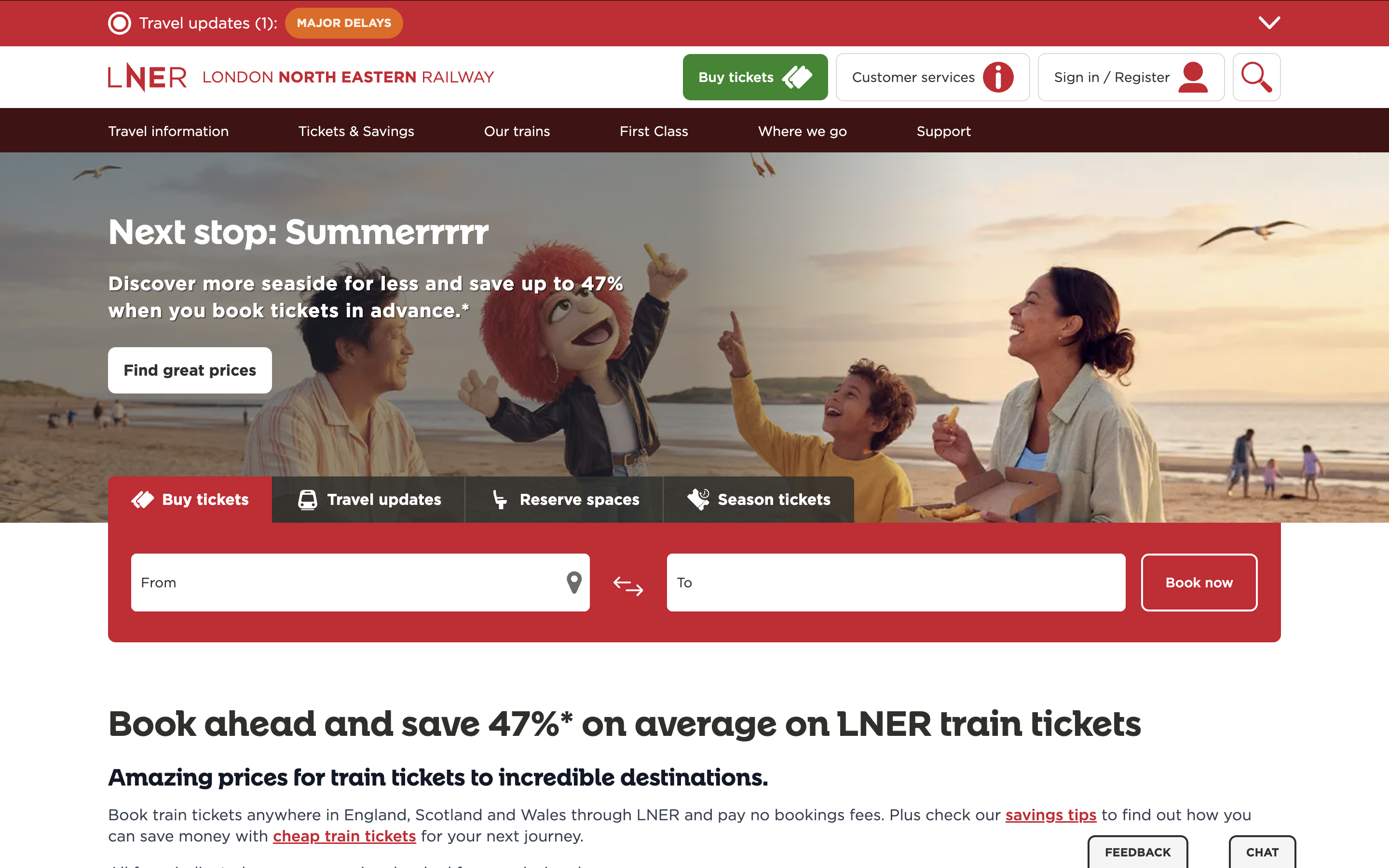
The navigation system feels overwhelming causing key information to get lost within the clutter. The complex booking flow and unclear navigation makes it difficult for users to find journeys, compare fares, and complete ticket purchases smoothly.
LNER website
My Approach
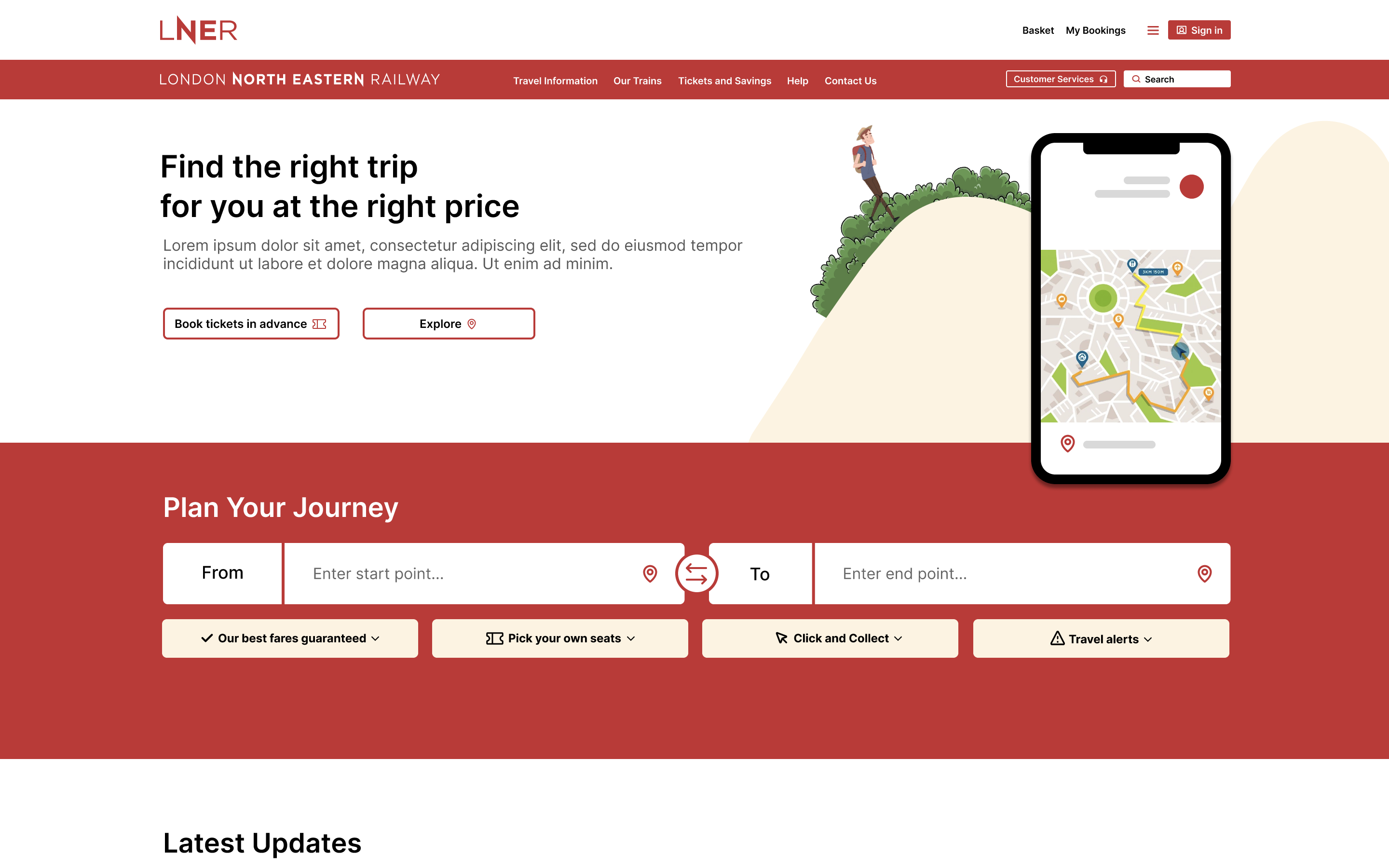
Through identifying pain points, I was able to focus on improving the booking journey, information architecture, and usability. Restructuring meant addressing usability issues by streamlining the journey search and ticket selection process.
I created custom assets and illustrations to help break up large sections of text and make information easier to scan. By introducing visual elements throughout the interface, users can process content in smaller, more digestible chunks.
Experimentation
Simplified the landing page by removing the extra clutter.
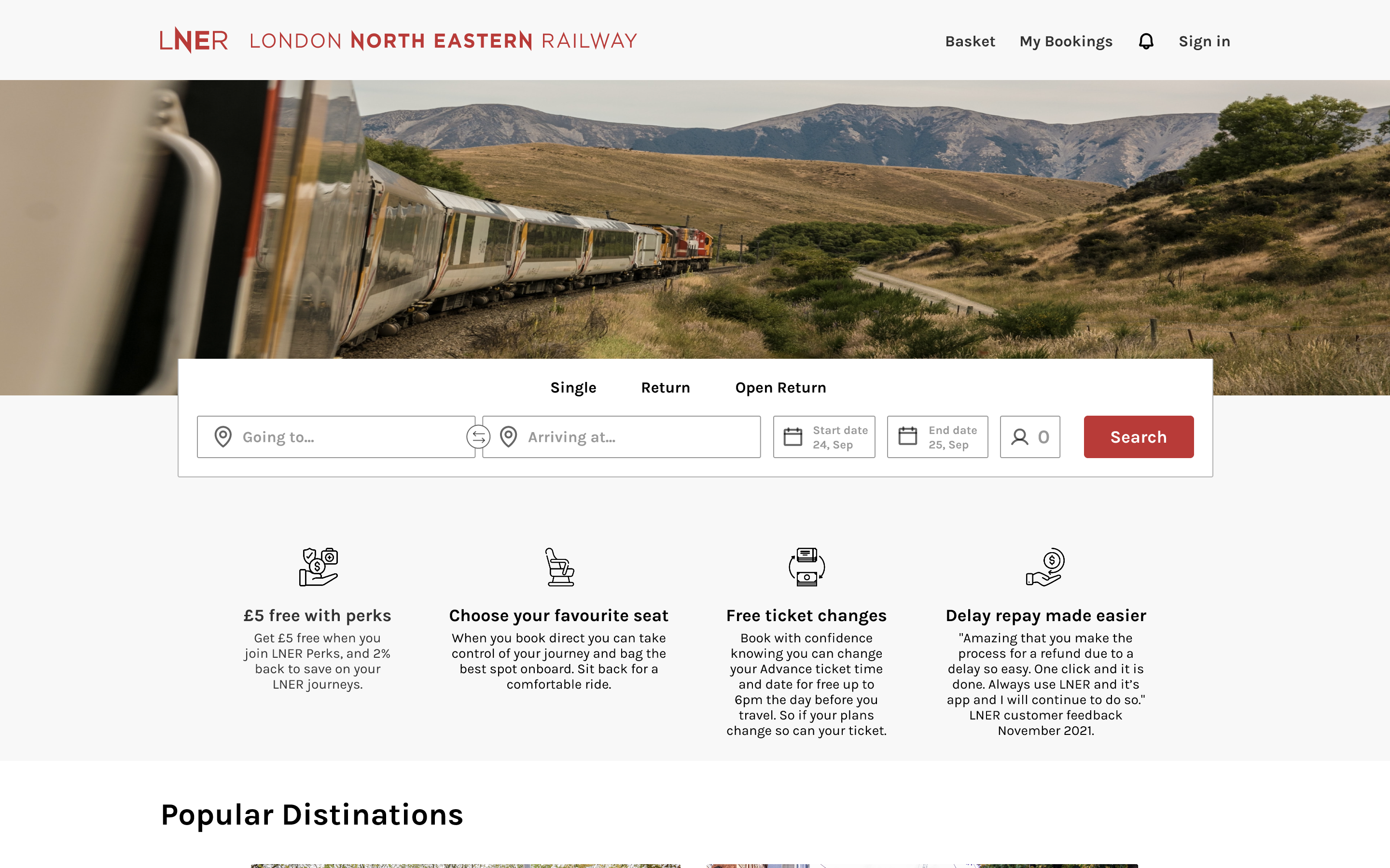
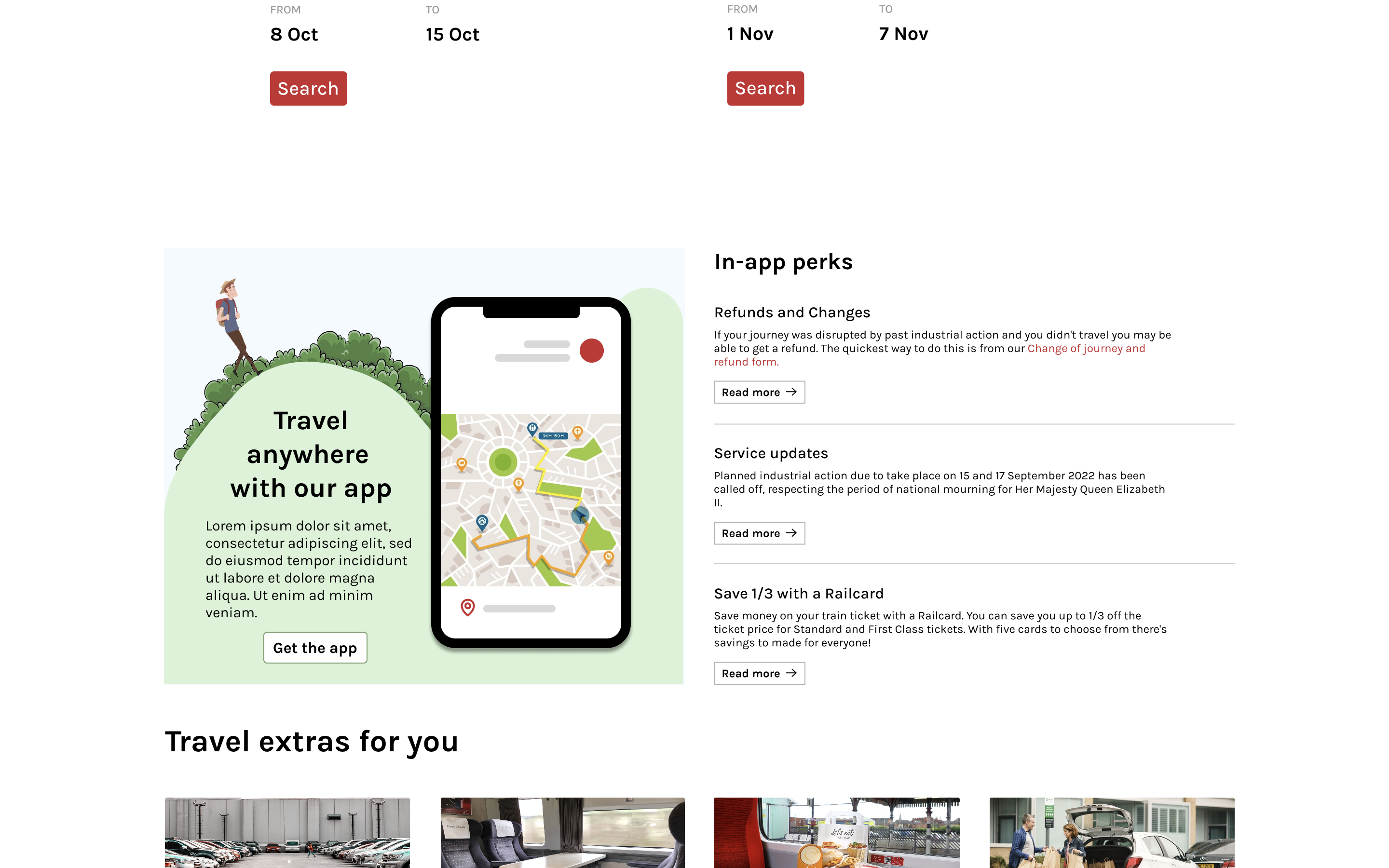
Repurposed my original design of the landing page to promote LNER's app for users that need it on the go.
My Solution
I streamlined the booking journey to reduce friction, simplify decision-making, and help users complete ticket purchases more efficiently. My aim was to take large amounts of information spread across multiple sections and condense the most important content into one single place.
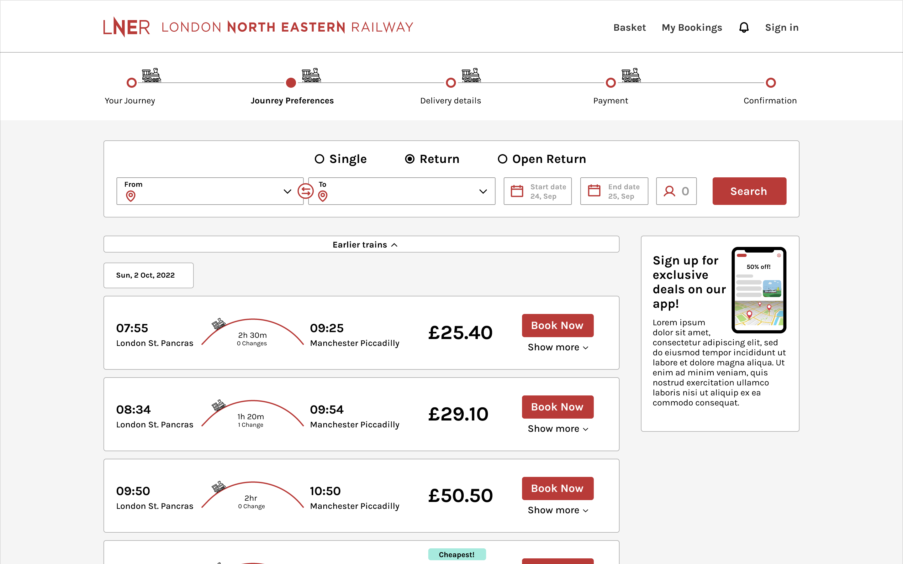
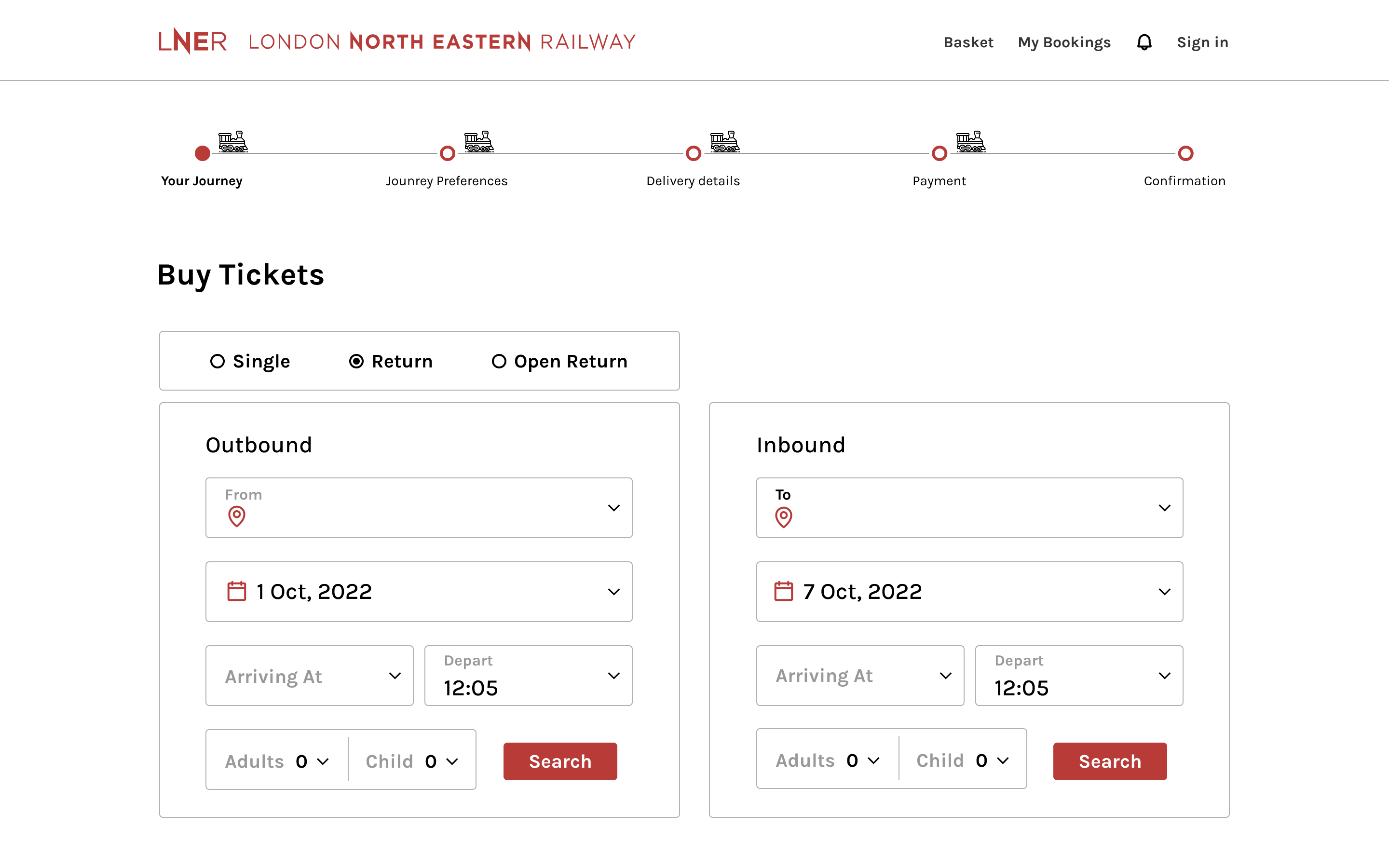
Streamlining the booking process reduces cognitive load, allowing users to focus on choosing the best travel option rather than figuring out how to use the website.